Design Digest, Italy
Kickstarting Design Digest with their brand identity.
Design Digest is a start- up consultancy based in Italy. They do more than just create brands – they bring them to life. As an independently owned establishment, they are deeply committed to infusing brands with vitality and resonance.
The founding team approached me to design their brand identity and make a guide for their new brand that is unmistakably Design Digest to help them kickstart their new company.
Timeframe
2 Months
Sector
Brand strategy, Consulting, Creative agency
Tools
Miro, Figma, Adobe Suite

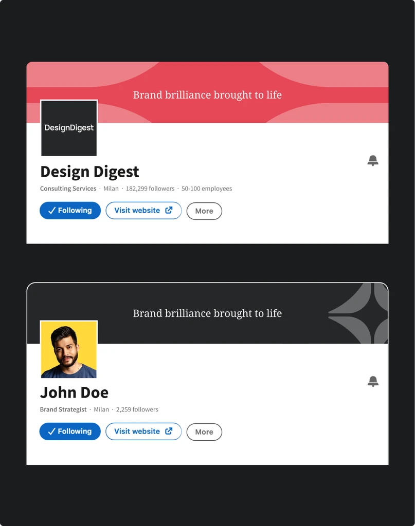
Idea: Brand brilliance brought to life
In the spirit of collaboration with the founders of Design Digest, we embarked on a journey to rewrite the rulebook of brand
creation. The result? A new visual identity that practises beyond the Cookie Cutter Approach, harnesses data through design
and unlocks complex value with simplicity.

Visual identity: Unmistakably brilliant
To symbolise delivering brand brilliance and exploration, all visual elements were made to be simple, yet detailed. The new
brand elements allow Design Digest to communicate end product they bring through their values- “Brilliance”.
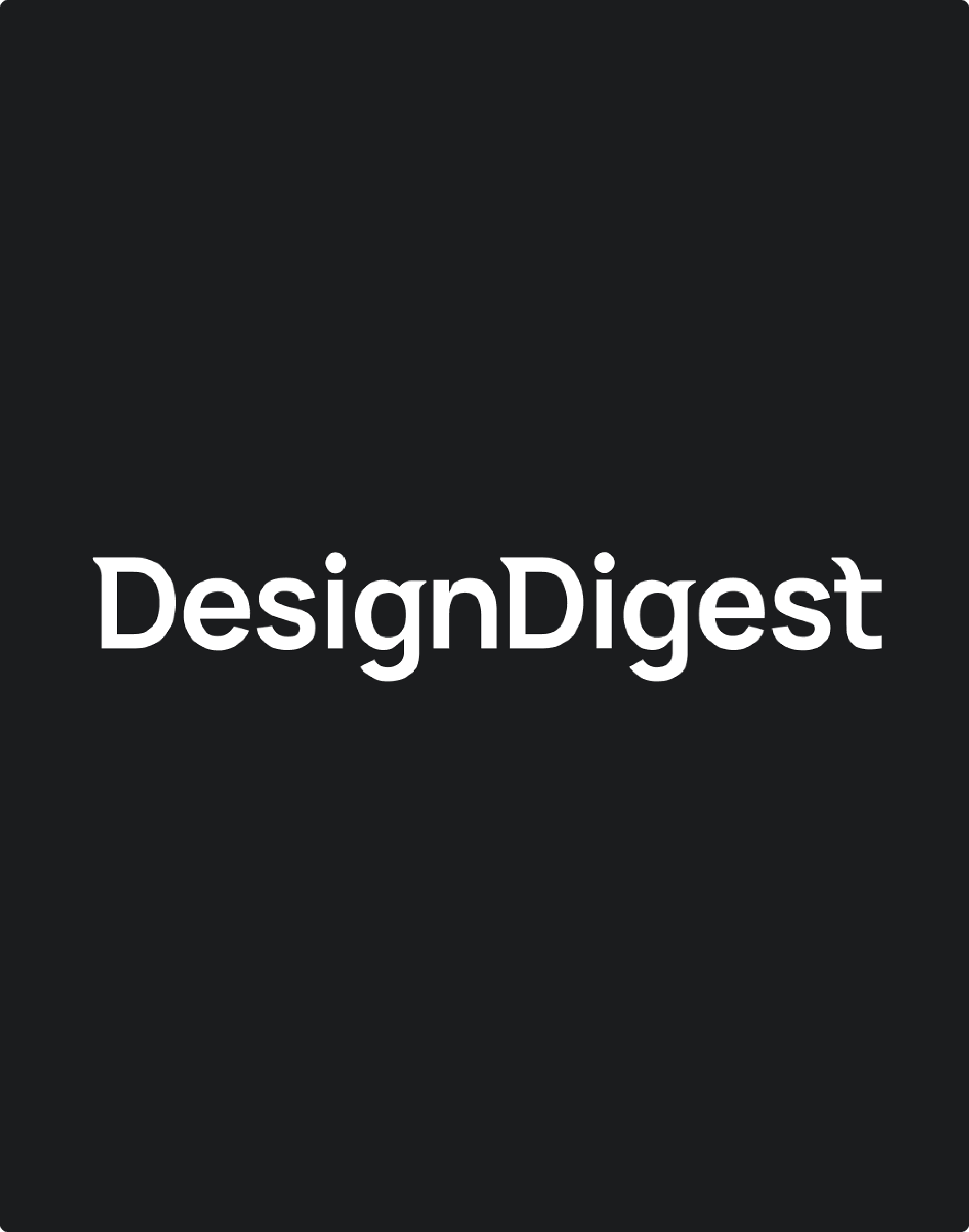
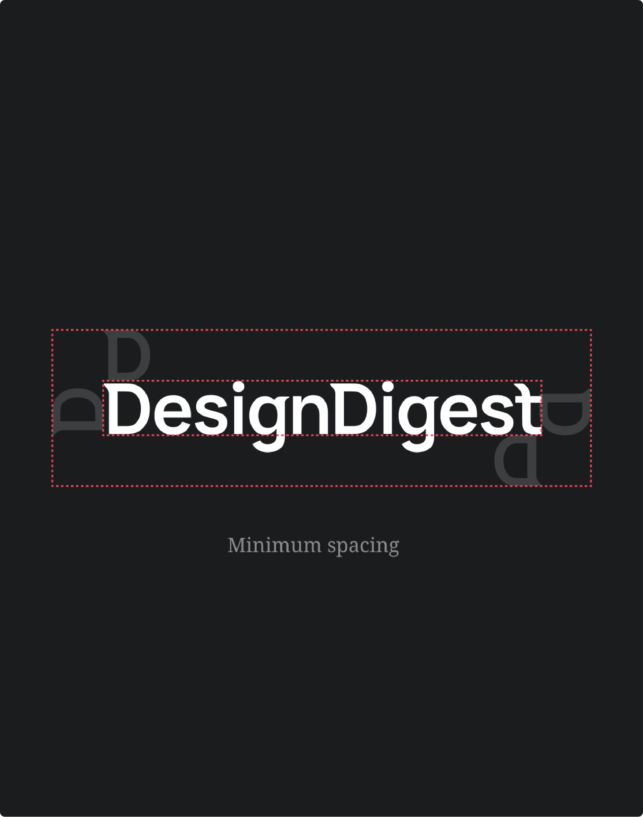

Wordmark
A simply bold, yet bespoke workdmark of the company name stands as the centerpiece of their branding. This bespoke workmark is meticulously designed to serve as their full lockup and projects reliability.
The wordmark is crafted with a modern sans-serif typeface, it features letterforms that have been customized to ensure a unique representation of their identity, setting them apart from the ordinary and reinforcing their commitment to a contemporary, tailored approach to design.
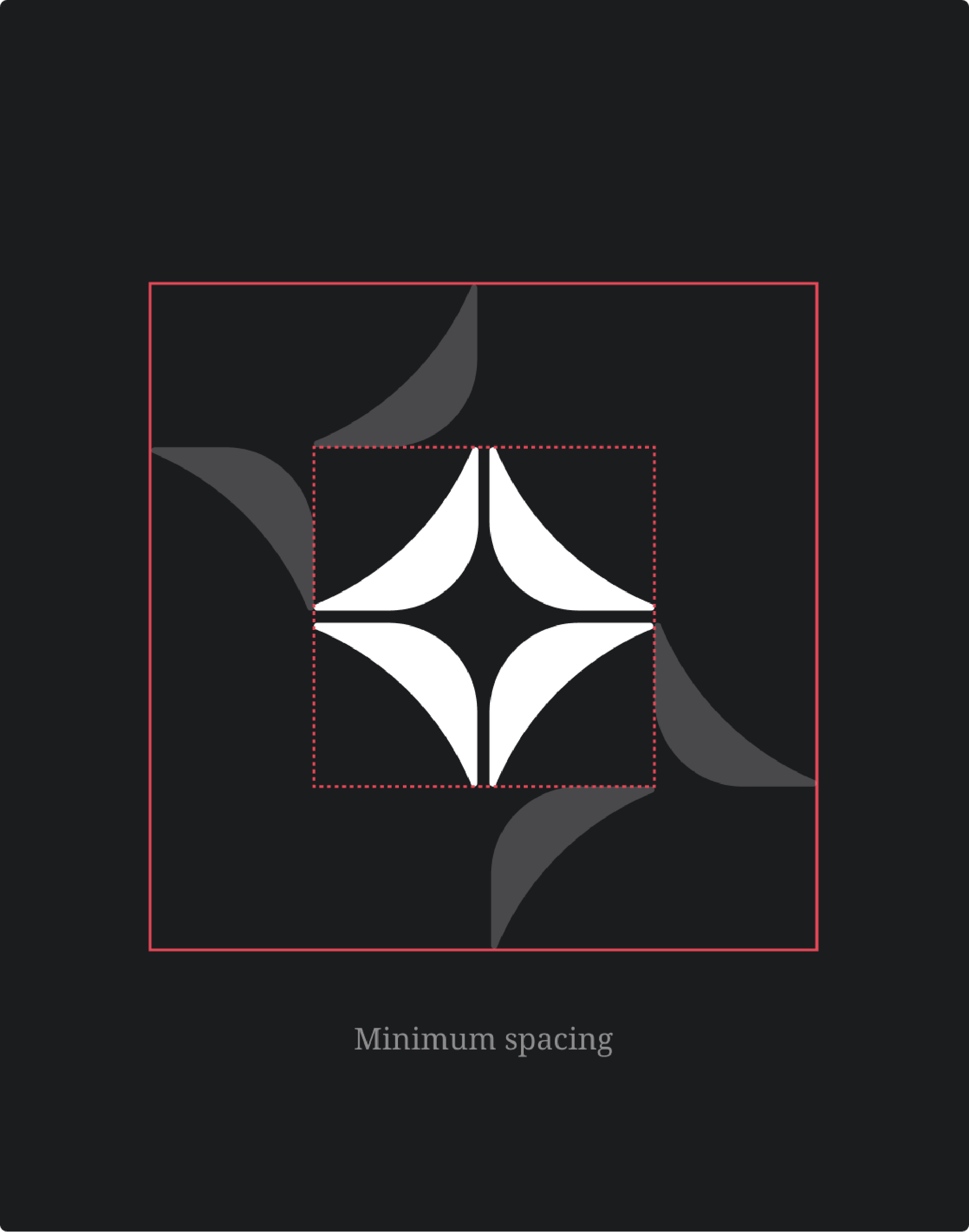
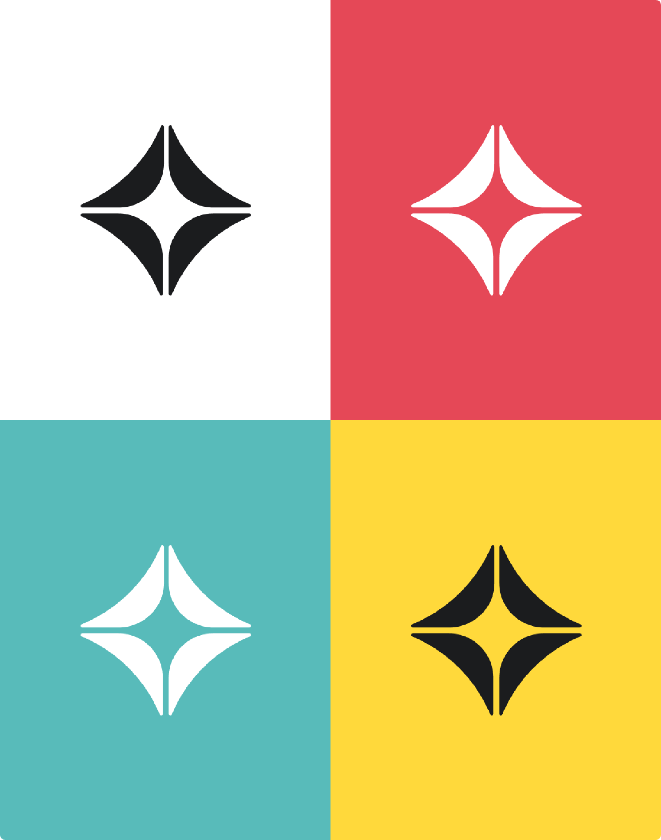
Logomark
This diamond inspired logomark, while not the primary logo, serves a crucial role as a versatile element in the brand’s identity. It is selectively deployed, strategically placed to enhance the overall design. Its adaptability is a key feature; the logomark can function as a supergraphic, making a bold and memorable statement when needed


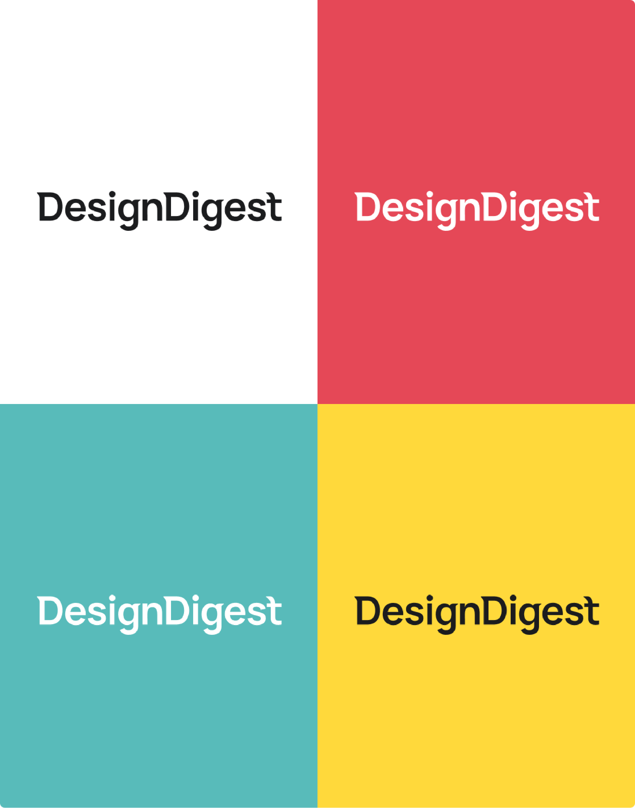
Colors
To elevate the feeling of straightforwardness with a twist of radicalism, the hero colour Off- black and is paired with the all time obvious Pure White. To offer a harmonious accent that feels vibrant and bright the hero colours can be paired with the secondary Red, Teal and Yellow.
This colour system also ensures that Design Digest has flexibility in its tint range to support its product needs in various industries.

Off black
R 12 G 12 B 12
HEX: 1B1C1E

Pure white
R 12 G 12 B 12
HEX: FFFFFF

Red
R 12 G 12 B 12
HEX: E54857

Yellow
R 12 G 12 B 12
HEX: FFD93B

Teal
R 12 G 12 B 12
HEX: 72D2C2
")
Typography
Design Digest’s typeface provides a consistent, legible, and friendly typographic voice. It strikes a balance between not being overly editorial, preserving a dynamic quality imparting energy and modernity, while showcasing a timeless appeal.
It’s a strategic decision that ensures every communication, be it in print or digital, carries a lasting impact. Its versatile and adaptable nature makes it a reliable tool in maintaining the brand’s visual identity
Bespoke icons
I designed three bespoke icons for the company to represent their three company USP’s in the simplest form. They should be used to help convey what they stand for and how they help their potential clients.
The bespoke icons were specifically designed to be a mix of abstract, yet symbolic representations of the three pillars which are:
01.
Beyond the Cookie Cutter
“ We embrace uniqueness by devising
extraordinary solutions that defy the ordinary.”
02.
Harness Data through Design
“We don’t just guess what works – we use an iterative and analytical approach to see what works and why.”
03.
Unlocking Value with Simplicity
“We believe simplicity breeds the most impactful brands. Thats where the value is.”


Stock icon style and colour exploration
")
Tone of Voice
Design Digest’s typeface provides a consistent, legible, and friendly typographic voice. It strikes a balance between not being overly editorial, preserving a dynamic quality imparting energy and modernity, while showcasing a timeless appeal.
; it’s a strategic decision that ensures every communication, be it in print or digital, carries a lasting impact. Its versatile and adaptable nature makes it a reliable tool in maintaining the brand’s visual identity
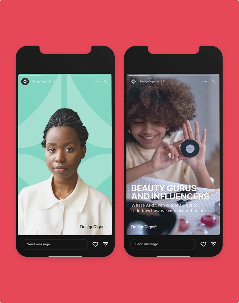
Other implementations
A simply bold, yet bespoke workdmark of the company name stands as the centerpiece of their branding. This bespoke workmark is meticulously designed to serve as their full lockup and projects reliability.
The wordmark is crafted with a modern sans-serif typeface, it features letterforms that have been customized to ensure a unique representation of their identity, setting them apart from the ordinary and reinforcing their commitment to a contemporary, tailored approach to design.
Next steps
This diamond inspired logomark, while not the primary logo, serves a crucial role as a versatile element in the brand’s identity. It is selectively deployed, strategically placed to enhance the overall design. Its adaptability is a key feature; the logomark can function as a supergraphic, making a bold and memorable statement when needed
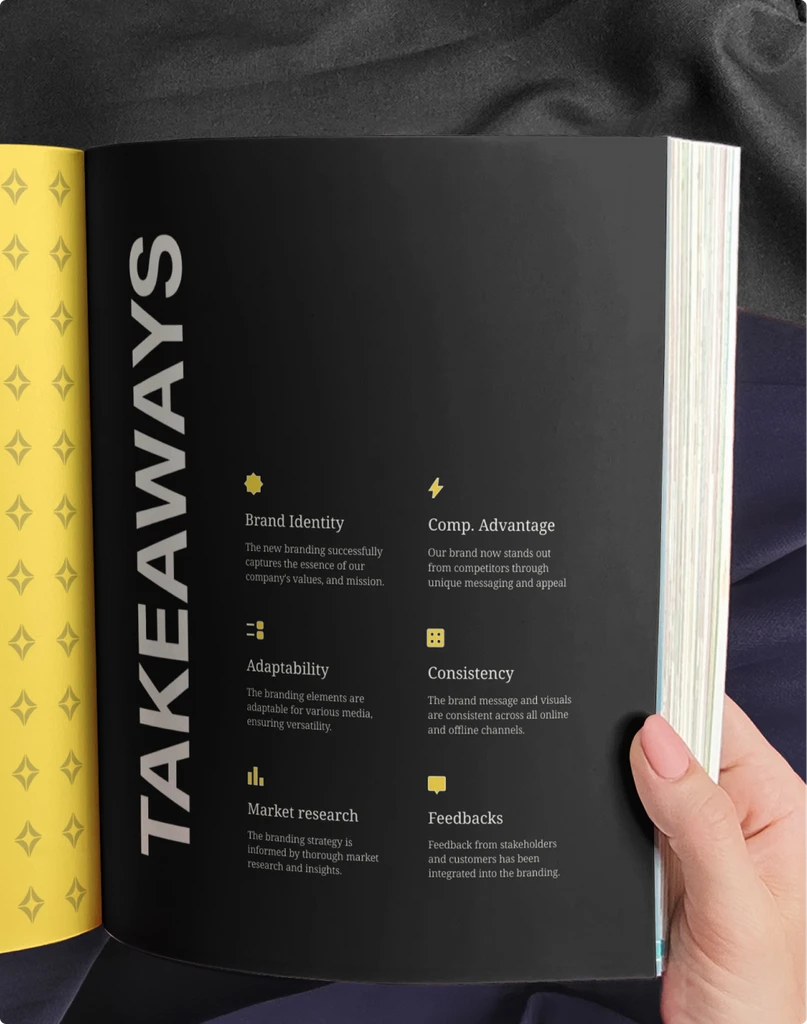
Developed a live interactive brand guideline
The brand guideline document is a dynamic and interactive experience that aims to foster a deeper understanding and connection to Design Digest’s brand essence. Further steps include adding guides for layouts and templates, and UI implementations.
")
Interested?
Want to know more
about this project?
Interested?
Looking to
collaborate on
your next project?